Accessible PowerPoint Documents
Overview
PowerPoint is a popular tool for creating presentation and slides. The slides are often shared digitally with users. The application is sometimes used as a layout program for creating documents. The topics below provide techniques for making your slides accessible, regardless of how users access them. The topics also assume usage of Microsoft 365 PowerPoint, 2024.
Microsoft has created an excellent document regarding accessible PowerPoint documents. It includes specifics for different platforms and devices, such as Windows, MacOS, iOS, Android, and Web. Please see Make your PowerPoint presentations accessible to people with disabilities.
Accessibility Checker

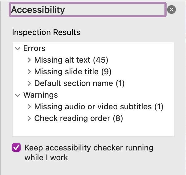
PowerPoint includes a tool for checking accessibility. Open the panel and keep it running; it will identify issues and help you resolve them while you work. The accessibility pane can be opened from the ribbon menu by selecting Review > Check Accessibility.
Caution: The checker will not detect and notify you of any color contrast issues. You will need to check the colors manually.
Document Title
All documents must have a document title. This benefits not only those with disabilities, but also helps users find the document when using search. The document title is part of the hidden file properties. There you can also include a subject (which is treated as the meta description and useful for search), keywords, and other information.
Note: If you Save As or Export a PDF, the document title is not included. It will need to be added using Adobe Acrobat Pro or another PDF editor.
Page Titles
Each slide must have a unique page title. If you are using a template, it will likely have a text area specifically for the title. If you create a custom text area for the title, you must mark it as a page title. From the PowerPoint ribbon menu, select Accessibility > Slide Title > Set as Slide Title.
If you have a slide without a title (visually), it still must have one to be accessible. There are a few ways to do this. Please see Microsoft's Title a slide guide.
Color and Text
The best practice for text in presentations is to format the text using sans-serif fonts, 18 points or larger. At this size, a contrast ratio of 3:1 between the foreground and background colors is needed. This can be tricky when background images are used. If smaller text is needed, try to use 14 points (but no less than 12 points). For smaller text, a contrast ratio of at least 4.5:1 between the foreground and background colors is needed.
Caution: The checker will not detect and notify you of any color contrast issues. You will need to check the colors manually.
Images
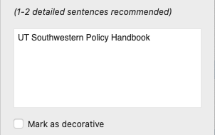
Images that contain text must include that text as ALT text. Please note that there is a 140-character limit for ALT text that is read back via screen readers. Images that are decorative and don’t really contribute to the meaning of the content can be marked as “decorative” by selecting the checkbox. The Alt Text pane can be opened from the PowerPoint ribbon menu by accessing Accessibility > Alt Text. It can also be accessed by a right click on the image.


Links
The text used for hyperlinks should always be descriptive, giving the reader a clear idea of what to expect when following the link. You should never use “click here” or “read more” for hyperlinks. Adding a ScreenTip is optional. It will display text when a user hovers and may be useful, providing additional information about the link when a short link title is necessary.
Tables
Tables should be limited to situations in which you need to present data by rows and columns; they should not be used for layout purposes. When a table is included, it should include a header row that defines the data in the columns. Avoid using complex tables with merged cells and multiple headers. The reading order of a table is critical to understanding the data, and complex tables are next to impossible to understand for those using assistive technology. Follow these tips for tables:
- Use a header row
- Avoid using fixed-width columns and tables
- Test tables on multiple devices
- Test the slide when the magnifier is used or when zoomed in
- If hyperlinks are used, edit the link text for concise links that don't break in odd places
- Test with a screen reader
Templates
PowerPoint utilizes templates to provide consistency across your slides. Be sure to test your templates to ensure they are accessible before using them across your presentation. The accessibility edits you make to the templates will carry through to your slides.
Video and Audio
If you are embedding audio or video in your slide presentation, make sure to use captioned video or provide a transcript for audio. Please see Multimedia (Video & Audio) Accessibility for more details.
Reading Order
Those with visual disabilities often use a screen reader to read back to them the content of the document. When creating a document, it is important to keep this mind. By default, the objects on the page will be read in the order in which they were added. This is not always the logical order or how you want the user to hear the content. The Reading Order pane will help you put the objects in the proper order. Please see Microsoft's Reading Order pane instructions on how to do this.
PDFs
To maintain the meta data and accessibility elements that were defined when building a Microsoft Word document, you must use the Save As function to create a PDF. Using a Print to PDF function will strip away the accessibility elements, and tables may lose their left-to-right reading order. Be sure to run the Accessibility Checker before creating a PDF to ensure that the document is accessible.
To create a PDF:
- From the File menu, select Save As.
- From the File Format menu, select PDF.
- From the other options:
- Windows: select Options, and then select the Document structure tags for accessibility checkbox
- MacOS: select the Best for electronic distribution and accessibility (uses Microsoft online service) radio button
- Select OK/Save.
